Detailed results examples
For each validation site, the results are analysed in detail and examples for one of the sites are shown below.
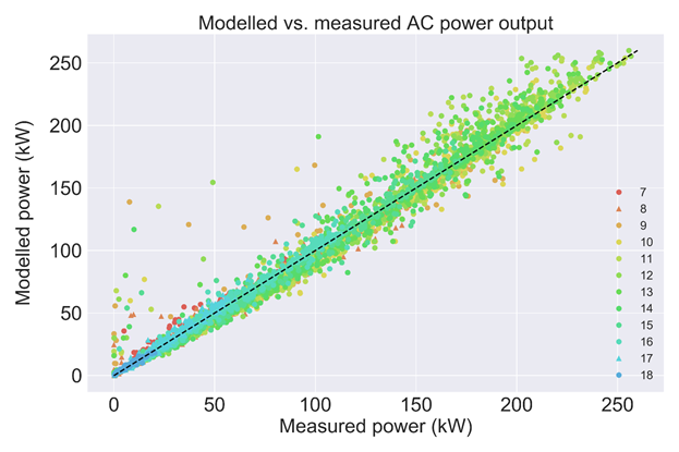
Plotting the modelled vs. the actual power output visualises the general agreement between the two datasets, indicating any systematic bias when the data points don’t follow the ideal 1:1 trend and the overall scatter related to the RMSE. Colouring the data points by time of day (as below) or month can help to identify clusters of outliers.
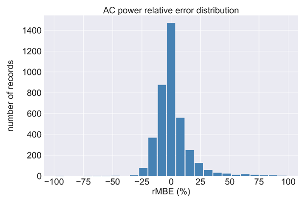
Binning all rMBE values helps to understand the distribution of the errors around the mean. Visualised in a histogram, the data should ideally be centred at 0 % relative bias, with a spread that is normally distributed.
When aggregating the data points over different periods, one can look at seasonal or diurnal modelling accuracies. As for example shading effects have strong seasonal and diurnal dependencies this is important to look at in detail.
rMBE by time of day is shown below in a box plot. The box represents the rMBE range including the middle 50 % of the data points so it is limited by the lower and upper data quartile. The length of the box is the interquartile range and is a measure of the data scatter. The line inside the box marks the median. Its position within the box indicates the skewness of the error distribution. It should ideally be in the middle of the box. The whiskers extend from the box to show the range of the data.
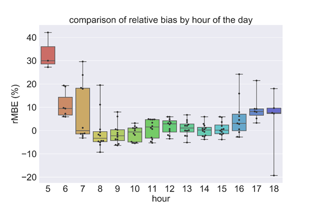
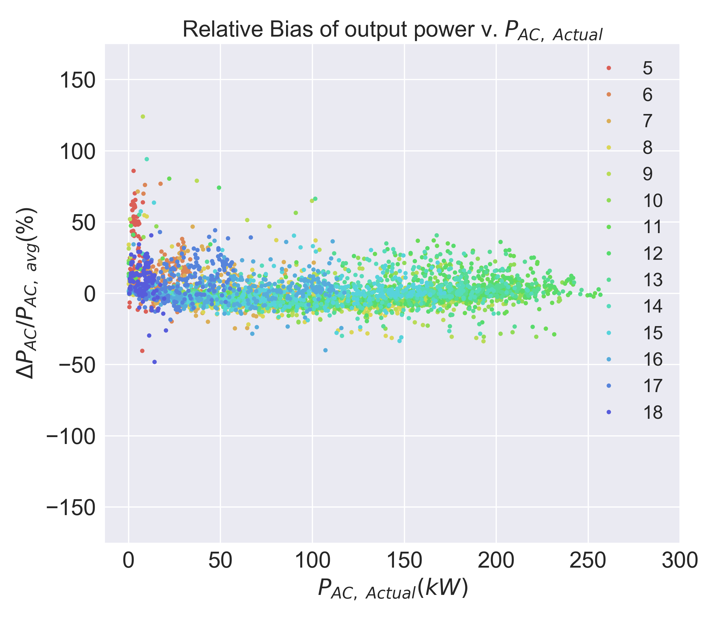
The median should ideally be close to 0 % rMBE, indicating no systematic bias but it should be noted that if the scaling factor is relatively small compared to the bias, then the relative bias will be disproportionately larger than in other intervals. For example, the output power at 5AM is typically very small compared to noon, so even though the bias may be smaller, the relative bias will be disproportionally bigger.
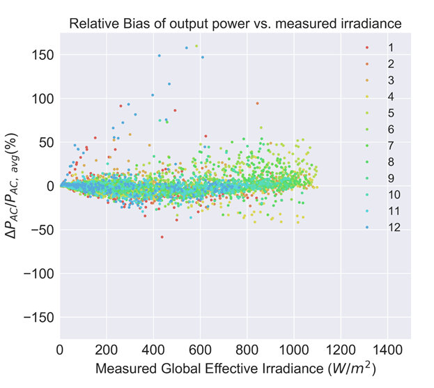
To see if there is any systematic relation between the relative bias and any of the independent variables like measured irradiance, we plot relative bias versus the independent variables. If the error is uncorrelated then there should be a random distribution. Cross-correlation against shaded irradiance measured in the plane of array and grouped by month are shown below.
To see if there is any systematic relation between the relative bias and the dependent variable, AC output power, we plot the relative bias versus the dependent variable. If the bias is uncorrelated then there should be a random distribution. Auto-correlation grouped by time of day are shown below. Some outliers from the general scatter centred at 0 % occur in the early morning that are related to the low power output used for the scaling.